Catalogue Note:
Ding Yi, who was born in Shanghai in 1962, is one of the leading Chinese abstract artists. After graduating from the Shanghai Art & Design Academy in 1983, Ding Yi was assigned to work in the Technology Section at Shanghai No. 12 Toy Factory, where he was involved in designing toys and toy packagings. Designing the work requires the production of large numbers of drawings, and the cross symbol was used extensively on these drawings to denote the need for the application of colors. This gave Ding Yi the inspiration for his Appearance of Crosses series of paintings, in which he sought to bring painting back to its essential formalist nature. Works of Ding Yi have been shown at the Venice Biennale in 1993, and the Biennale of Sydney in 1998.
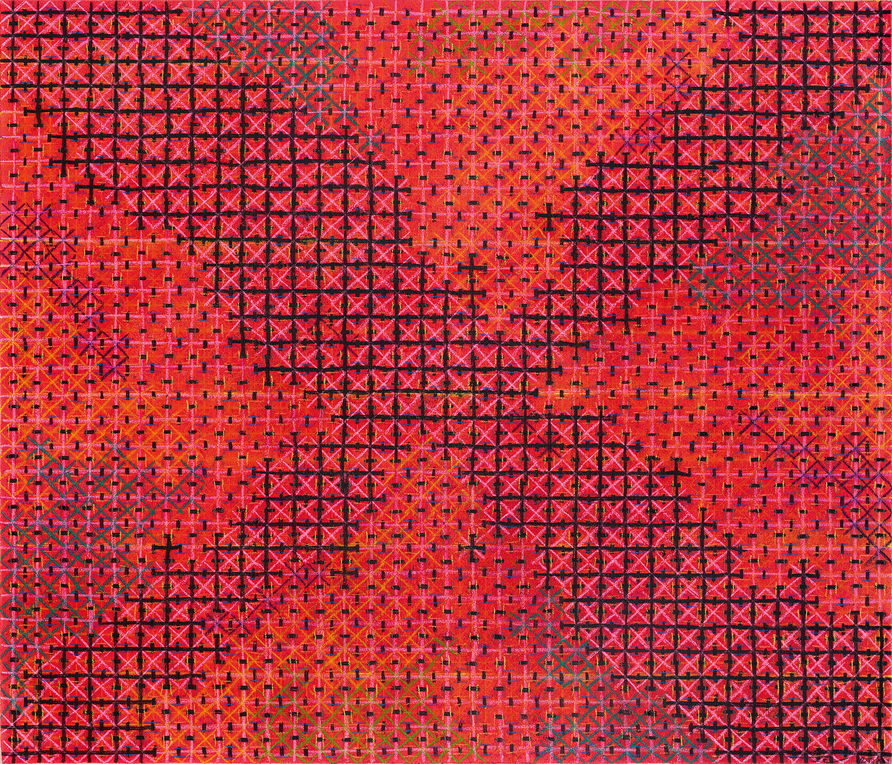
Ding Yi began working on the Appearance of Crosses series since the late 1980s. Regardless of whether these paintings take the form of a large, monochrome work, of a painting on cloth, or of a work using bright fluorescent colors, they are all entitled Appearance of Crosses and identified by a date and serial number. From Ding Yi ’s perspective, the repeated + or x signs are, in and of themselves, meaningless formal symbols; the artistic lexicon utilized in these works derives from the urban environment created by industrial development in post-socialist China.
Ding Yi offers this convincing interpretation of his own work: “The choice of the cross derives from the fact that it is a symbol with great potential meaning. In Ding Yi’s work as a designer, the cross appeared countless times to indicate precise coordinates that had to be followed in the coloration process.” As a printer’s symbol, the cross had no inherent symbolic meaning or connotations. Ding Yi aimed to eliminate every trace of the real, allowing painting to return to its essentially formalist nature. Given its role as a symbol indicating a four-color printing process, the basic elements of the cross are very simple, and yet once they have been carefully arranged, they are transformed into a fundamental shape that possesses a highly meaningful uncertainty and which offers almost unlimited interpretative potential.
From 1989 onwards, Ding Yi began using fabric in his art, giving it a more conceptual feel. This particular work is an example of Ding Yi’s paintings on cloth. Taking a piece of tartan fabric as its base, the painting is created on top, with rich, warm colors starting to take shape as the brushstrokes are applied, creating a textural effect that could be said to be latent in the work. The multiple layers of lines of varying thickness contrast perfectly with one another, and the latticework of crosses is more than just a simple array of symbols; it embodies the same kind of beauty seen in Chinese calligraphy, and seems to reflect the dialectical hermeneutics of Chan (Zen) Buddhism. By comparing with the earlier works of the Appearance of Crosses series, the latticework approach used in this particular painting embodies a richer, more complex aesthetic, reflecting the mastery of the artistic lexicon provided by the latticework method that Ding Yi had achieved by this point, and the flexibility that he displayed in utilizing it.